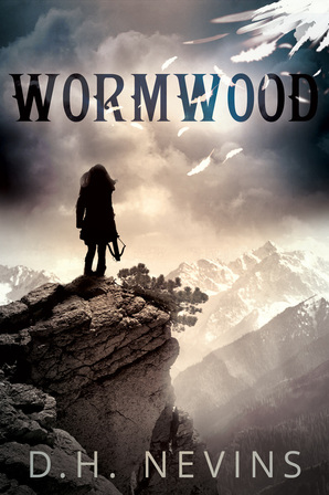
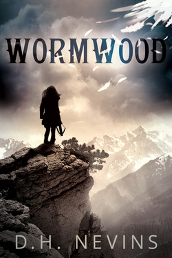
This beauty took my breath away the moment I saw it. As an author, I couldn’t ask for a better representation of my work. And I’m kind of picky—so that says a lot! The image projects a mood that reflects the feel of my story so perfectly, I knew the cover artist understood Wormwood on multiple levels. But even if we’re just talking aesthetics, well, I might be biased, but I think this is one fantastic-looking cover!
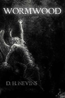
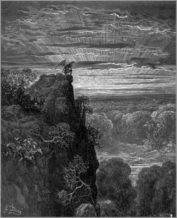
I originally had a different cover for Wormwood. It was a simple black and white etching by Gustave Doré, depicting a fallen angel reaching towards the heavens. The sheer turmoil apparent through the angel's expression and pose not only fascinated me, but seemed a perfect depiction of the conflict raging through Tiamat, a half-angel in Wormwood. However, the etching--although classic--was hardly a trendy cover. The story itself was very well-received, but I found that people had trouble getting past the antiquated-looking cover in order to take a chance on reading what was within. My love for the cover, it seemed, was a lonely one!

About a month ago, I was contacted by cover artist extraordinaire, Derek Murphy. He had read Wormwood and subsequently offered to make up a new cover for the book. Curious about the vision he had for Wormwood, I heartily agreed.
Then, as you know, the resulting cover blew my expectations out of the water! Its impact was immediate.
The image depicts the book genre clearly. The colour contrast is striking, which catches the eye instantly. Plus, it’s incredibly professional.
It also fits the story.
On a literal note, the protagonist is a strong female, adept with a crossbow, yet still out of her element. However, she would never admit it. I could see this in her stance. Yet the cover holds so much more than a simple literal representation of Wormwood. Derek recreated the feel of the book perfectly. The mixture of light and darkness remind me of a review from Tome Tenders about Wormwood, which, in part, said, "The lines will be blurred between good and evil, love and hate, truth and lies, and hero and antagonist." The hazy fusion of sunlight and shadow reflect this beautifully. The unsettled, foreboding skies mirror the mood of this dark, post-apocalyptic story, and the falling feathers are a nice touch. They hint at the half-angels in the story without hitting potential readers over the head with their existence. The fact the feathers are broken and falling is also perfect, but I hesitate to say why... after all, I don't want to spoil the most exciting parts of the book!
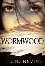
It was exceedingly difficult to select my favourite cover. Every mock-up Derek created was incredible in its own right, and it would be a shame not to share them. So in all their glory, here are the other options he came up with.
Naturally, I wouldn’t be sharing this with you if it wasn’t for Derek Murphy. His outstanding covers and unprecedented talent can be seen on his website, CreativIndie Covers. Have a look at http://bookcovers.creativindie.com/




 RSS Feed
